
Psychological Analysis: How Color Influences First Impressions in Dating
In the split-second world of digital dating, your brain processes color before it even registers facial features. Research shows that certain hues can trigger deep-seated emotional responses, influencing everything from perceived trustworthiness to sexual attraction. In 2026, the strategic use of color in your profile photos is no longer a “style choice”—it’s a high-impact psychological tool designed to make you stand out in a saturated market.
🔥 Quick Verdict
The **”Red Effect”** remains the most powerful phenomenon in dating psychology, signaling passion and energy. However, balance is key. Using a mix of high-energy colors like red and calming tones like blue or white creates a multi-dimensional persona that attracts high-quality matches across both casual and elite platforms.
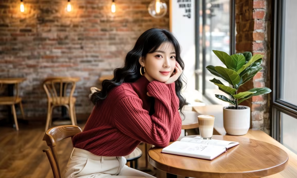
1. The Power of Red: The Biological “Click”
Countless studies in evolutionary psychology have confirmed the “Red Effect.” Both men and women find individuals wearing **red** significantly more attractive and sexually desirable. Red signals health, vitality, and social dominance. It is the most “eye-catching” color in the visible spectrum, making it the perfect choice for your primary profile photo if you want to stop the scroll.
High-Impact Hues
- Vibrant Red: Passion, energy, and dominance.
- Royal Blue: Trust, stability, and intelligence.
- Crisp White: Cleanliness, honesty, and openness.
- Emerald Green: Harmony, growth, and relaxation.
Risky Tones
- Neon Yellow: Often perceived as annoying or cheap.
- Dark Brown: Can appear dull or overly conservative.
- Busy Patterns: Distracts from your facial features.
- Grayscale: Too much black/grey can seem unapproachable.
2. Blue for Trust and Stability
While red sparks initial interest, **Blue** is the color of long-term compatibility. It is universally associated with the sky and the ocean, invoking feelings of calm, reliability, and wisdom. For elite dating platforms where users are looking for serious partners, blue is often a safer and more effective primary color choice than red.
3. White: The “Blank Slate” Effect
Wearing white in a brightly lit environment projects an image of cleanliness and honesty. It makes your skin tone pop and suggests you are an open, approachable person. It is especially effective in “Lifestyle Photos” (see Article #7) where you want to show a relaxed, domestic side of your life.
4. The Psychology of Background Colors
The colors behind you matter just as much as what you wear. A background filled with natural greens (plants/trees) signals a healthy, balanced lifestyle. An urban background with warm sunset oranges and reds creates a romantic, cinematic vibe. Avoid cluttered, dark, or beige backgrounds that sap the energy from your profile.
5. Seasonal Color Strategy
In 2026, the most successful users rotate their color palette with the seasons. In spring/summer, lean into pastels and bright whites. In autumn/winter, utilize deep burgundies, navys, and forest greens. This subconscious signaling tells matches that your profile is “Fresh” and that you are an active participant in life.
Final Thoughts
Color is the silent language of attraction. By understanding the psychological cues of each hue, you can design a profile that speaks directly to the subconscious mind of your ideal match. Audit your gallery today: do your colors say “I’m exciting and trustworthy,” or are they making you blend into the background?
Ready to Spark a Connection?
Test your new high-impact profile on platforms that attract high-value, intentional singles.
Find Your Perfect Match Today* Secured links to elite dating communities with advanced social filtering.